As loyal followers of our brand journey we owe you a more in depth explanation. What, exactly, has happened over the past month? There’ve been a few changes and it’s only fair we share why. So, in this post we’ll lay bare our thought processes in the name of transparency.
1. THE NAME
Optiat. (Let’s call it our maiden name 😉) An acronym for “One Person’s Trash Is Another’s Treasure”. Relevant? Yes. Original? Yes. Hard to let go of for sentimental reasons? Yes. Easy to pronounce? No. Easy to spell? Apparently not*. Easy to communicate its hidden meaning? No. “It’s an interesting name but only once you’ve learnt what it means. It needs explaining, which makes it too forgettable to anyone who doesn’t understand it.”
So why UpCircle? We felt it succinctly summed up our circular skincare mission – it requires no explanation AND it’s a lot easier to read. A play on upcycle, up as in uplifting, and upcircle as a circular economy. Genius? We think so.
*Some of our most common mispronunciations: Opitat, Opiat, Optate, Opiate, Optitat – who’d have thought!
2. MISSION FRONT AND CENTRE
Our previous scrub range had a “theme inspired” approach, using big bold icons and alliterated names including “The Hungover” Potent Peppermint and “Pick Me Up” Lemongrass Lifter.
They were punchy, fun, and they stood out on the shelves. However, they communicated nothing about what make us, us. We made a name for ourselves by using recycled organic material in premium cosmetics – a scrub with wine glasses on the front is certainly attention grabbing – but this was at the expense of the communication of our core mission. Not ideal.
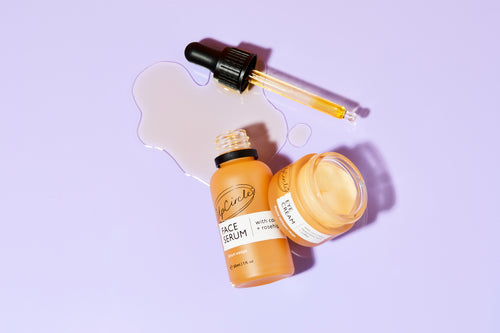
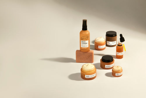
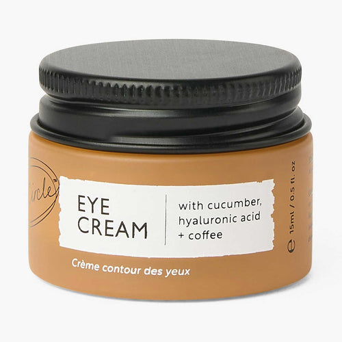
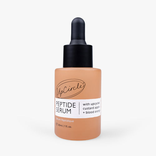
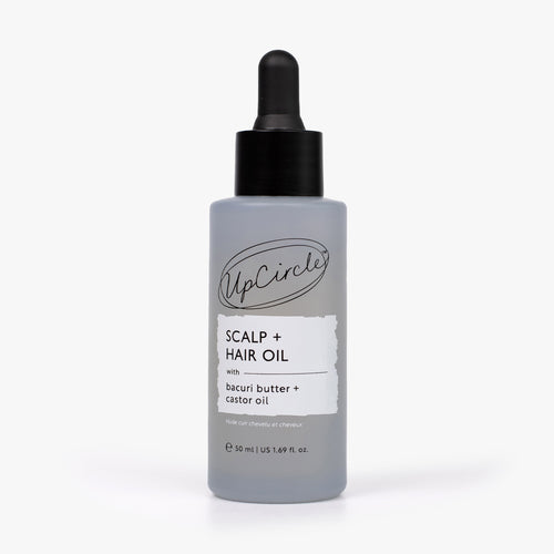
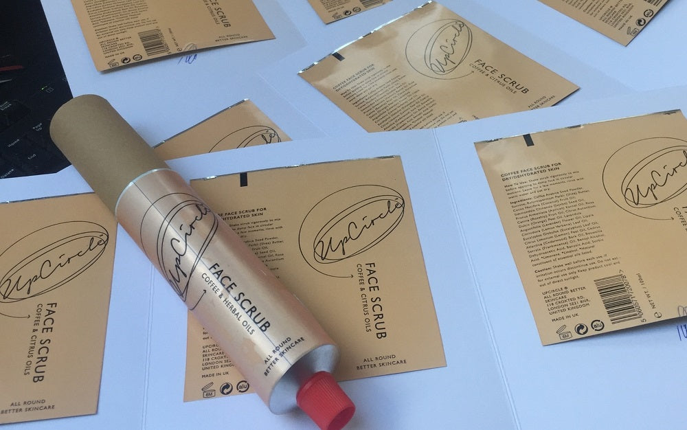
So, we stripped everything back, creating a streamlined look and feel, the repurposed ingredient is highlighted and stands proud on the front of each product. Our to-the-point copy with minimal visual cues allows you to focus solely on the products themselves.
3. HIERARCHY
As Optiat we launched with one range, our scrubs. We then went on to develop our face masks and then the soaps. Quickly it became clear that the hierarchy of messaging had gone awry. What worked for the scrubs simply didn’t work for the other ranges – we had different focuses for different products and all consistency went out the window.
For UpCircle we went back to a blank canvas and took a “who, what, where, when” sort of approach.
Clean, clear, concise communication. Simples.
4. COLOUR SCHEME
As Optiat, our Lemongrass coffee scrub, our Purifying face mask and our Fennel + Cardamom soap were all similar (but not identical) shades of green. But the products didn’t really have anything in common. Our Nourishing mask was purple, but why? When we didn’t have a single scent leading the product the colour choices became a little... random.
Again, we needed to take a step back to consider how we were making our colour choices. UpCircle has a soft neutral palette, well suited to a quality beauty brand – the colour denoting which part of the body the product is used on. Great for grouping, and perfect for future range expansion.
#HelloWorldDomination
5. BETTER PACKAGING
I’ll keep this one short. Since the very start our packaging has been 100% recyclable, but now as UpCircle we’ve reduced our plastic packaging by 99%. Pretty chuffed with that.
6. RANGE EXPANSION
It’s safe to say we’ve got lots of plans. And even more ideas. We’re on a circular skincare mission and our 5 year plan is pretty ambitious. As Optiat we released or pre-released 5 products (scrubs, face masks, soaps, lip balm and face oil) and had lost our brand unity.
Now we know that our current branding approach will work just as well for our current 4 ranges as it will for our future 10 thousand ranges!
What do you think? We'd love to hear your feedback in the comments below!
